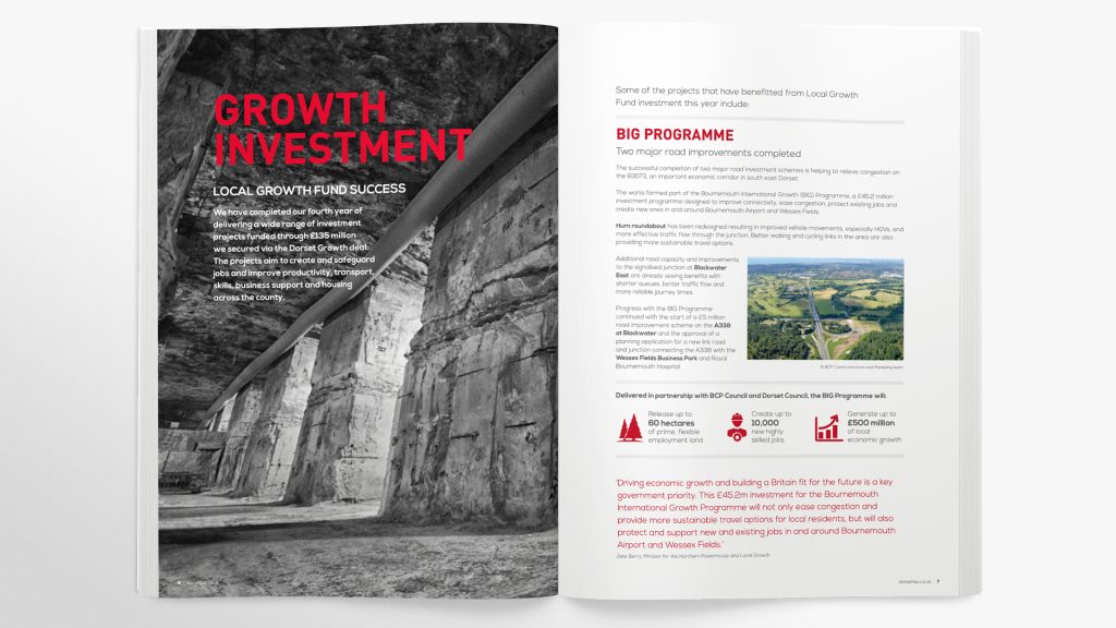
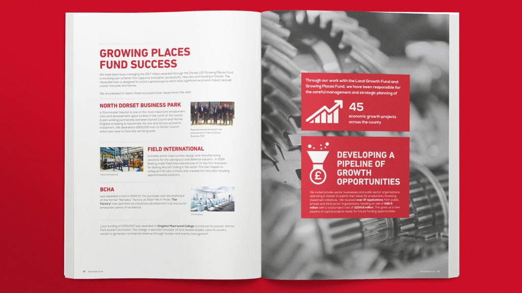
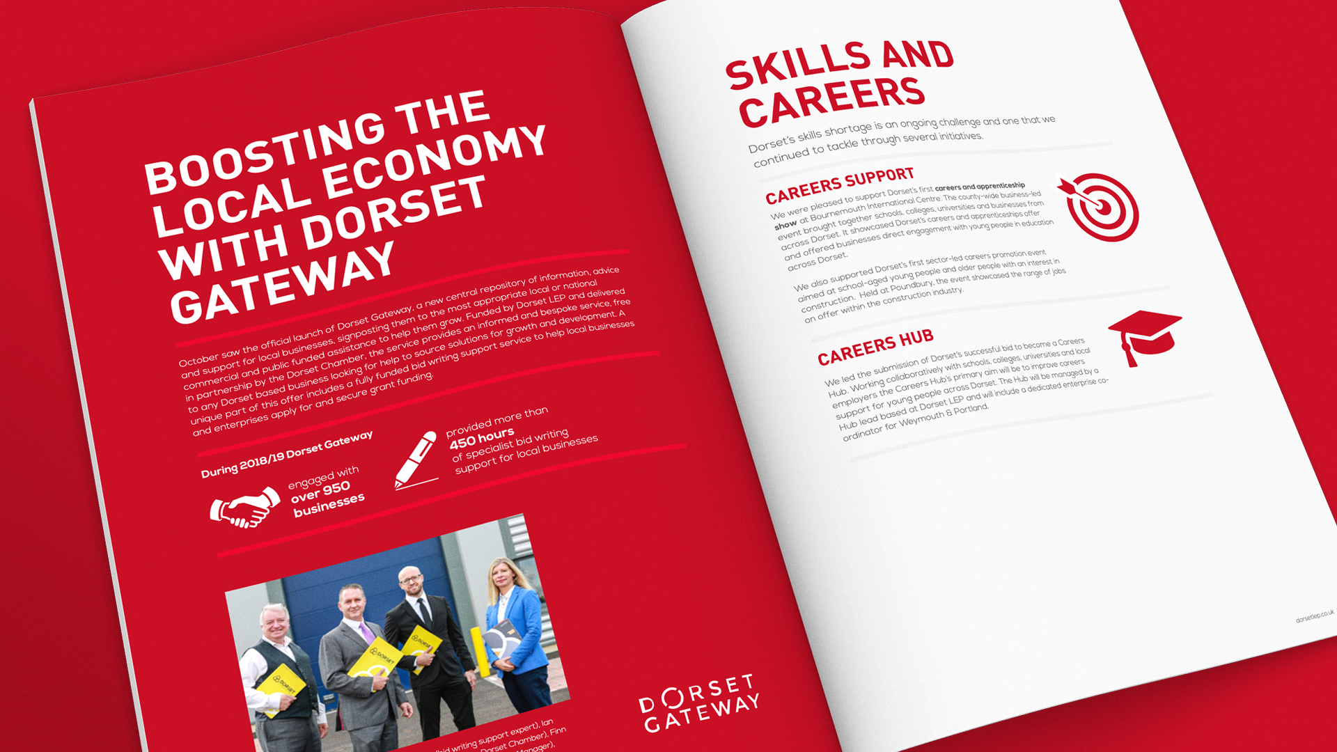
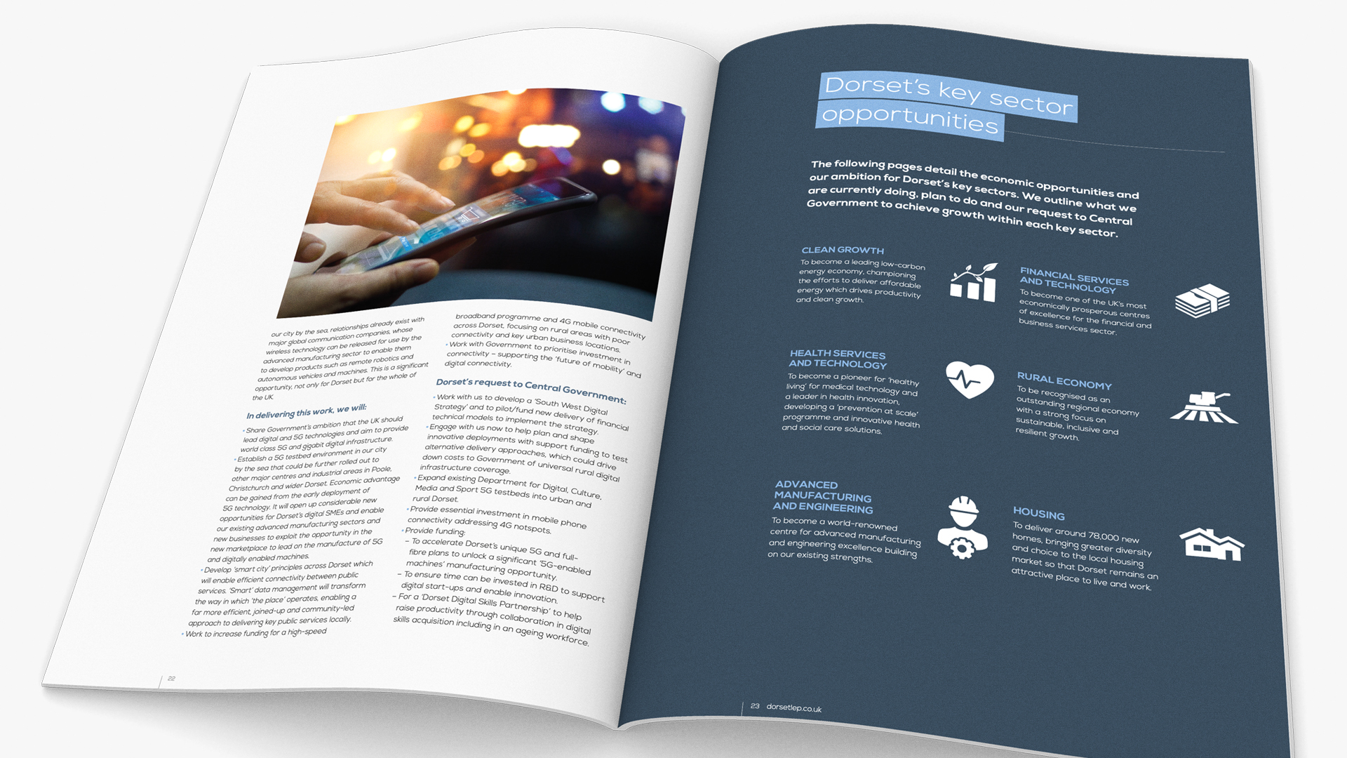
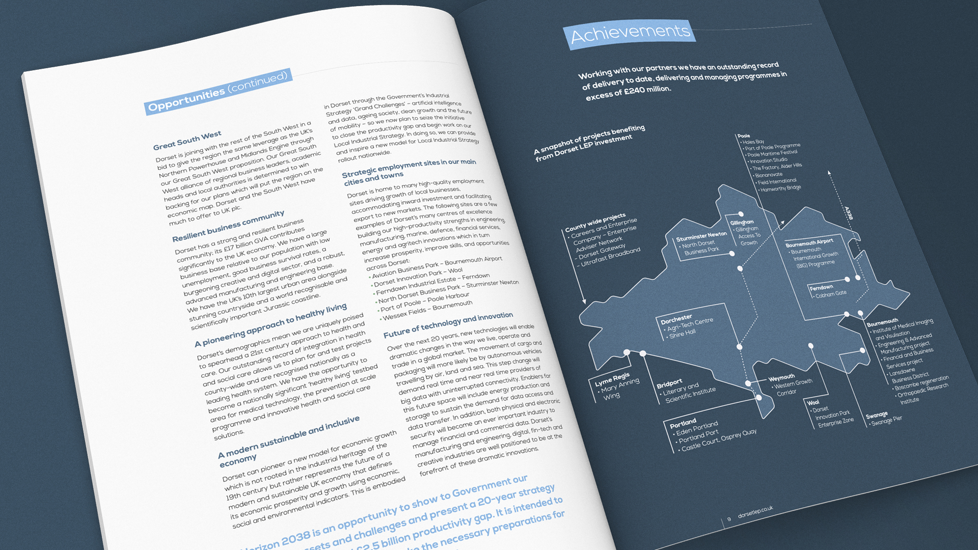
Our corporate experience came in useful for a series of publications — running for over a year — and a design-independent annual report for this local enterprise partnership. The content for the various statements is lifted by the widespread use of iconography to create visual interest and highlight salient points — this is partly in response to limited photography and also data being more of an ongoing, projected, figure rather than a specific.
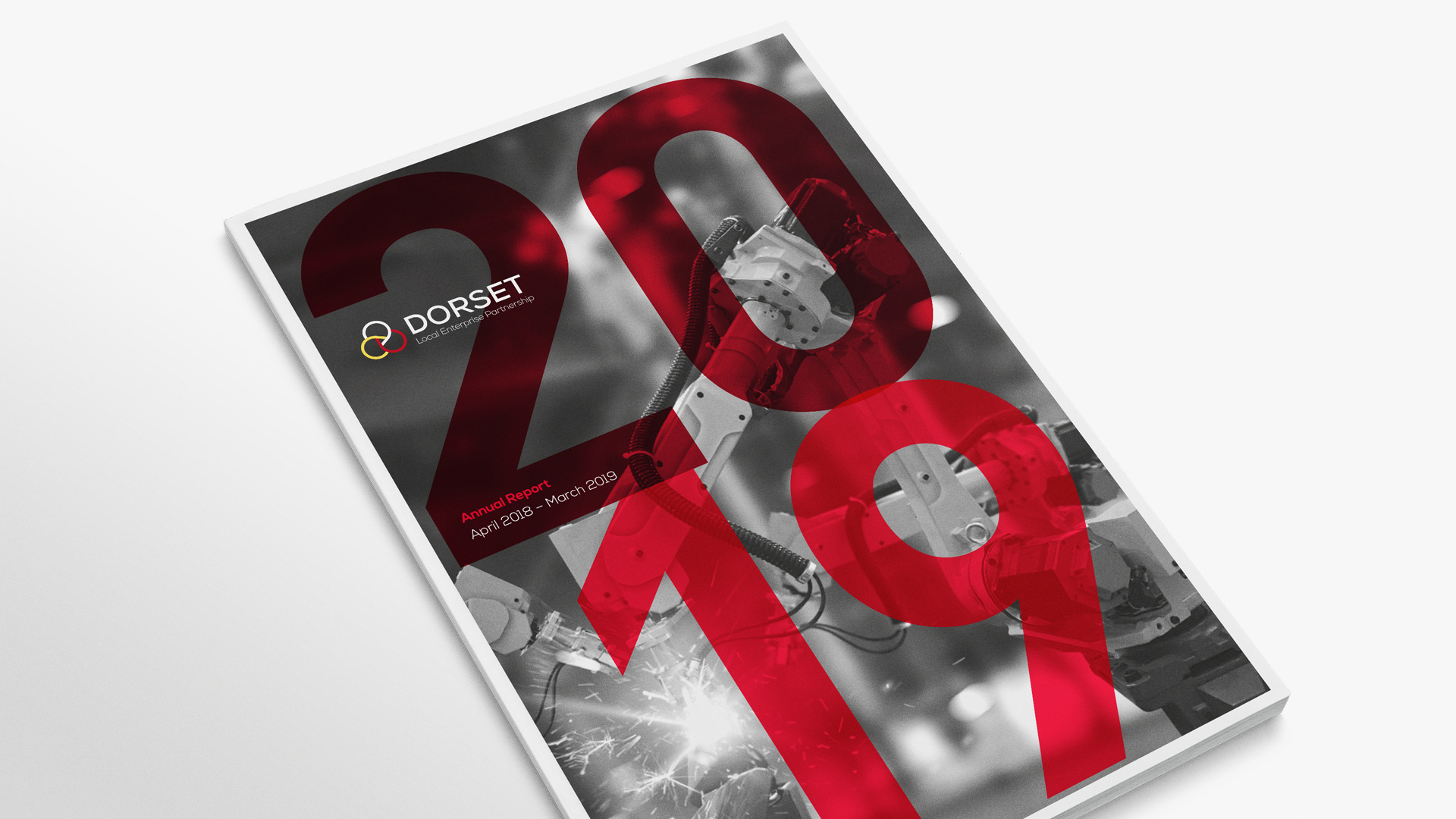


Full disclosure(!), we did not design the identity for the Dorset LEP but we did find and subtly highlight the ‘arrow’ moving forwards hidden in its curves! We also introduced a secondary typeface where there wasn’t one before. Small yet effective changes.