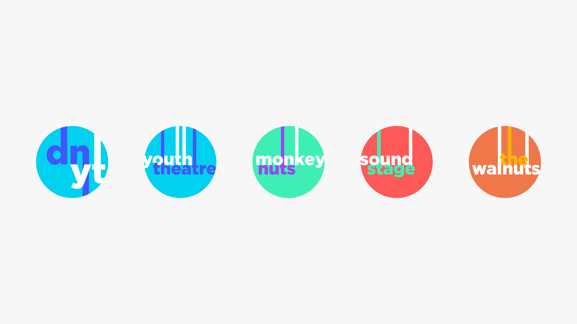
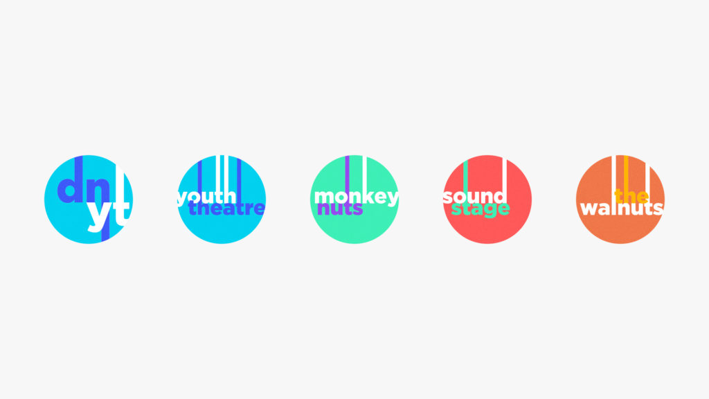
We were tasked with branding the four companies which make up the Discarded Nut Theatre Company, known as Discarded Nut Youth Theatre; Discarded Nut Monkey Nuts; Discarded Nut SoundStage, and; The Walnuts Acting Company. While Discarded Nut has its own identity, the four separate companies were not perceived to be individually attractive. The difficulty from a design point of view is that they all still had to appear as part of a ‘family’ of companies.
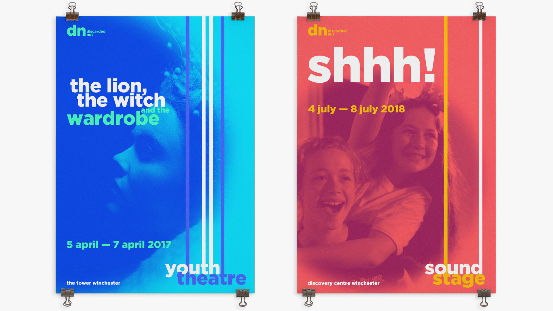
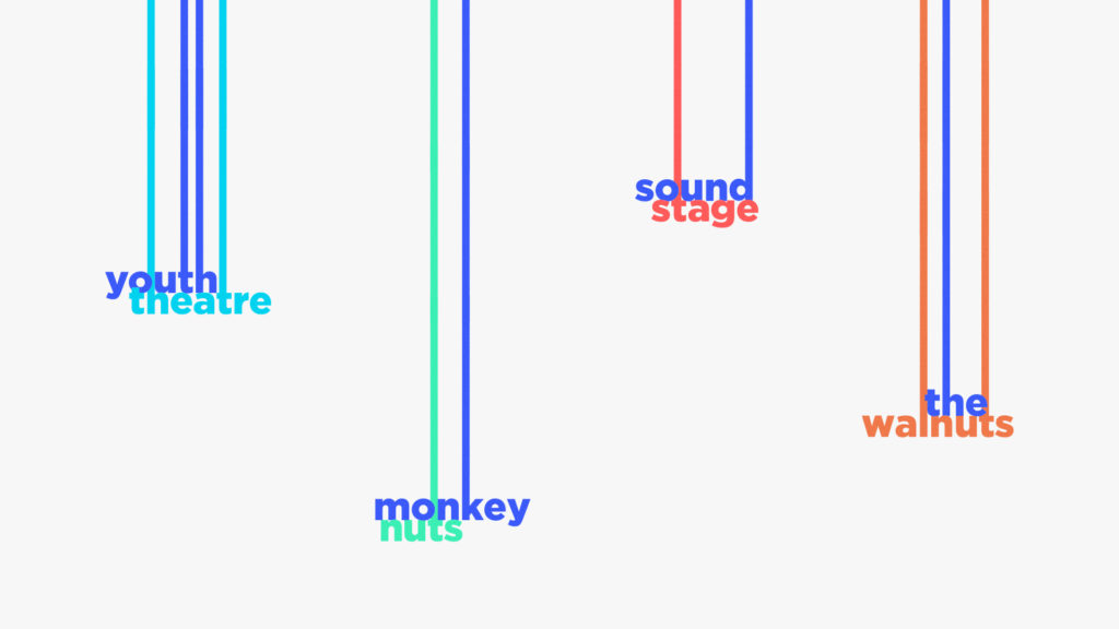
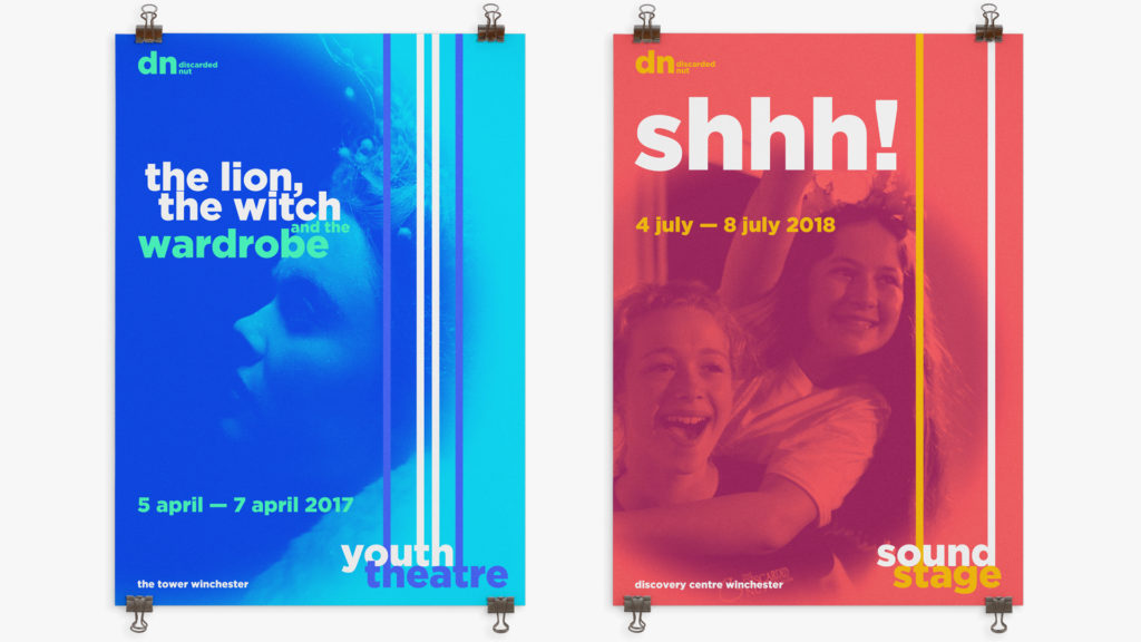
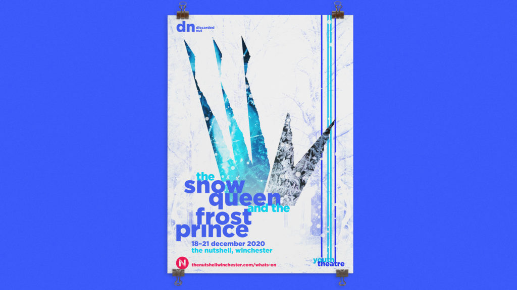
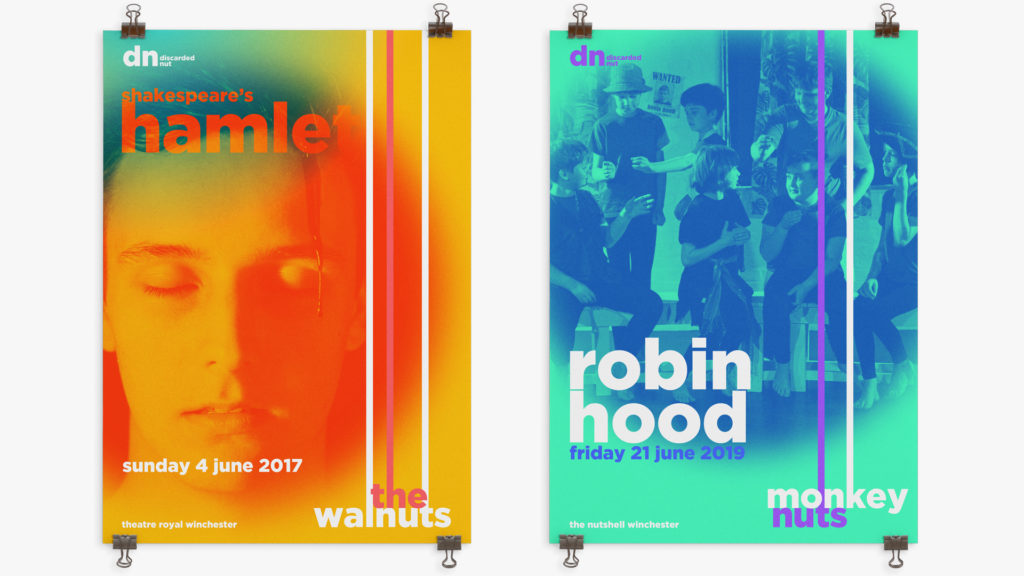
The answer came from a simplified expression of scenic backdrop mechanics where the identities can be variably ‘lowered’ as required. An added extension to this, for SoundStage posts, allows for animated stripes to rise and fall in rhythm. We provided layered templates for social media with on/off elements including the colour palettes to allow for maximum flexibility depending on photography used. The templates also include a ‘spotlight’ blended area which can be at multiples sizes, positions, and crops.
The answer came from a simplified expression of scenic backdrop mechanics where the identities can be variably ‘lowered’ as required. An added extension to this, for SoundStage posts, allows for animated stripes to rise and fall in rhythm. We provided layered templates for social media with on/off elements including the colour palettes to allow for maximum flexibility depending on photography used. The templates also include a ‘spotlight’ blended area which can be at multiples sizes, positions, and crops.