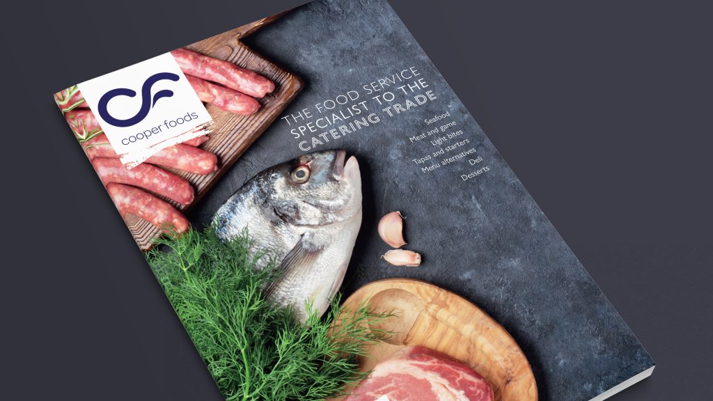
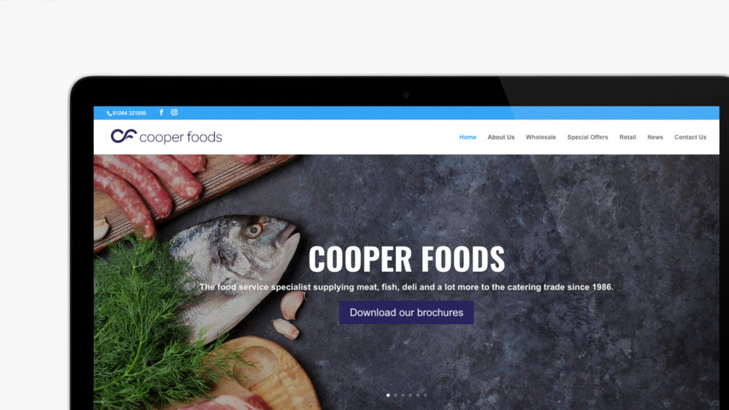
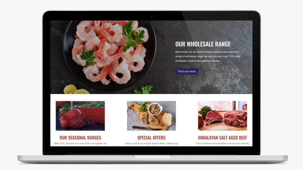
Having undergone a rebrand Cooper Foods required its marketing collateral, specifically their brochure and website, to be redesigned and for the brand to be extended beyond the original scope. For the brochure, we utilised the extensive variations and weights from the Gill Sans typeface allowing us to reference Victorian-style multi-font typography while being true to the brand and modern design considerations.
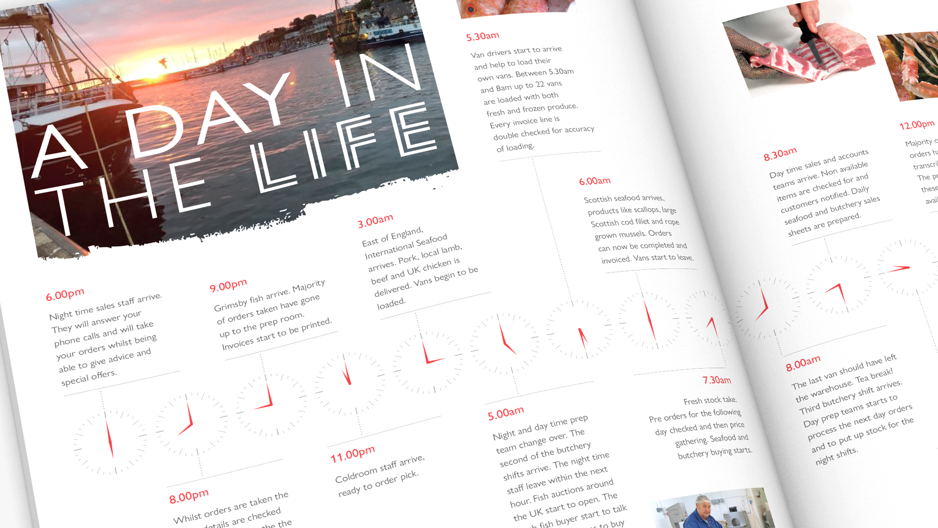
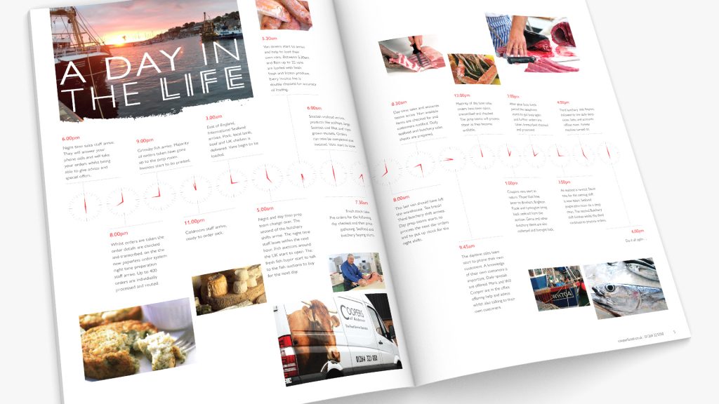
While in essence, this is a brochure displaying available produce, there was scope for an approachable corporate personality best presented with an editorial layout of the ‘day in the life’ spread.
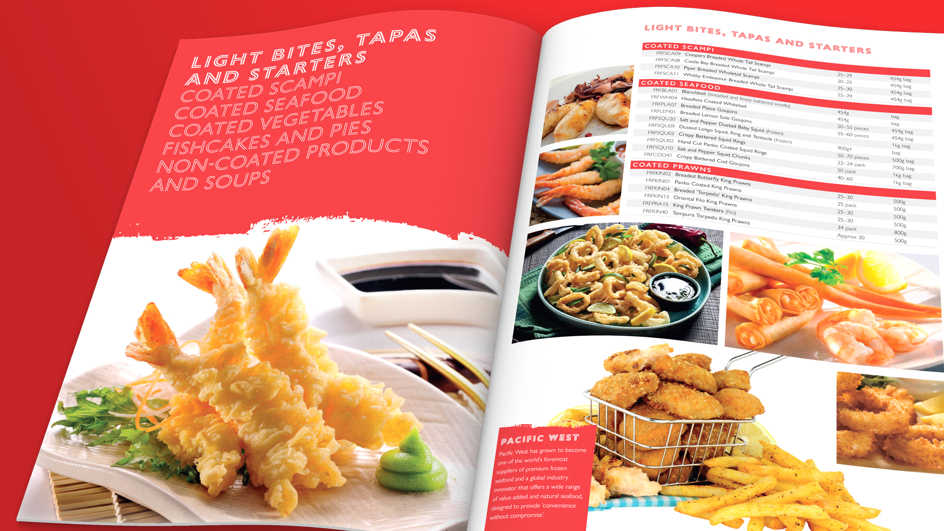
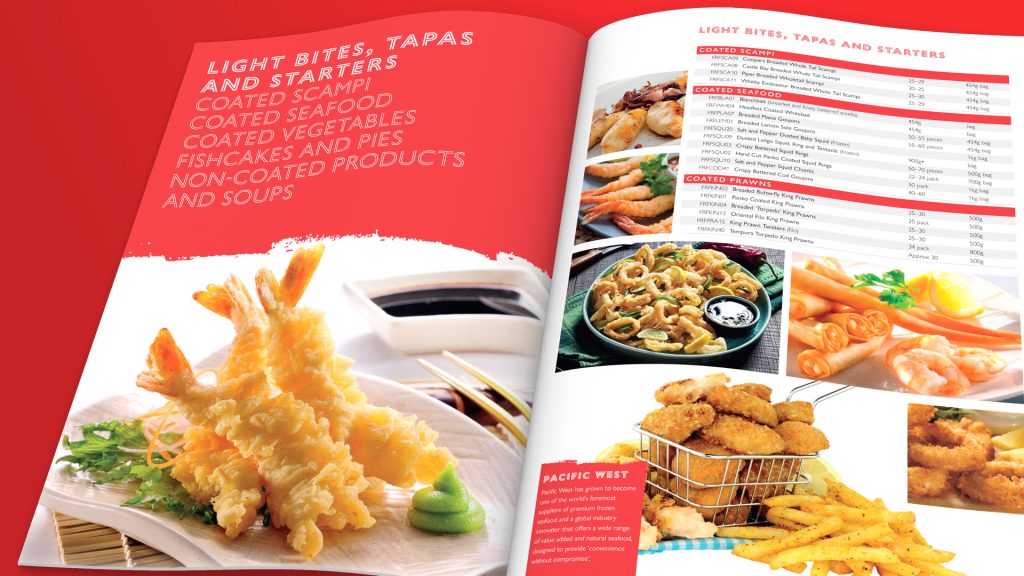
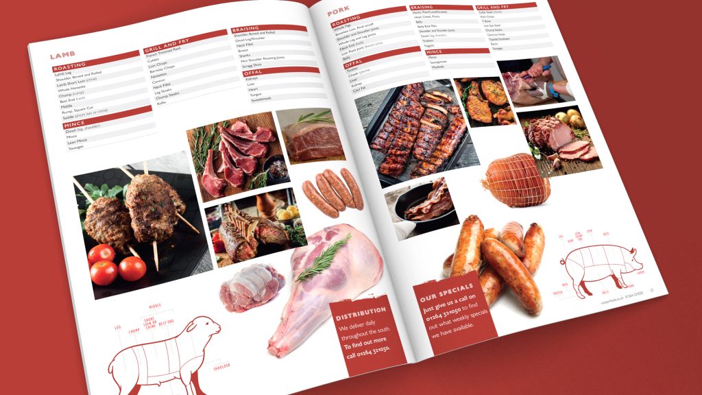
Other additional design touches included the painted edge effect on the colour panels and large introduction pages with close-up photography. The produce listings are clean and clear… the price list becoming a separate element to best extend the ‘shelf life’ of the brochure.
While in essence, this is a brochure displaying available produce, there was scope for an approachable corporate personality best presented with an editorial layout of the ‘day in the life’ spread.
Other additional design touches included the painted edge effect on the colour panels and large introduction pages with close-up photography. The produce listings are clean and clear… the price list becoming a separate element to best extend the ‘shelf life’ of the brochure.