The identity was an opportunity to illustrate that the Farnborough College of Technology offers university-level provision to the highest academic standards. The project included a 48-page prospectus, and for the following year, a folder with multiple inserts, but initially, we developed the identity. The marque is based on the concept of ‘unlocking potential’ and used a very graphic interlocking ‘U’ and ‘C’ – its sections allow us to play with colour distribution too as, while the colour palette is limited, their distribution has no clear definition.
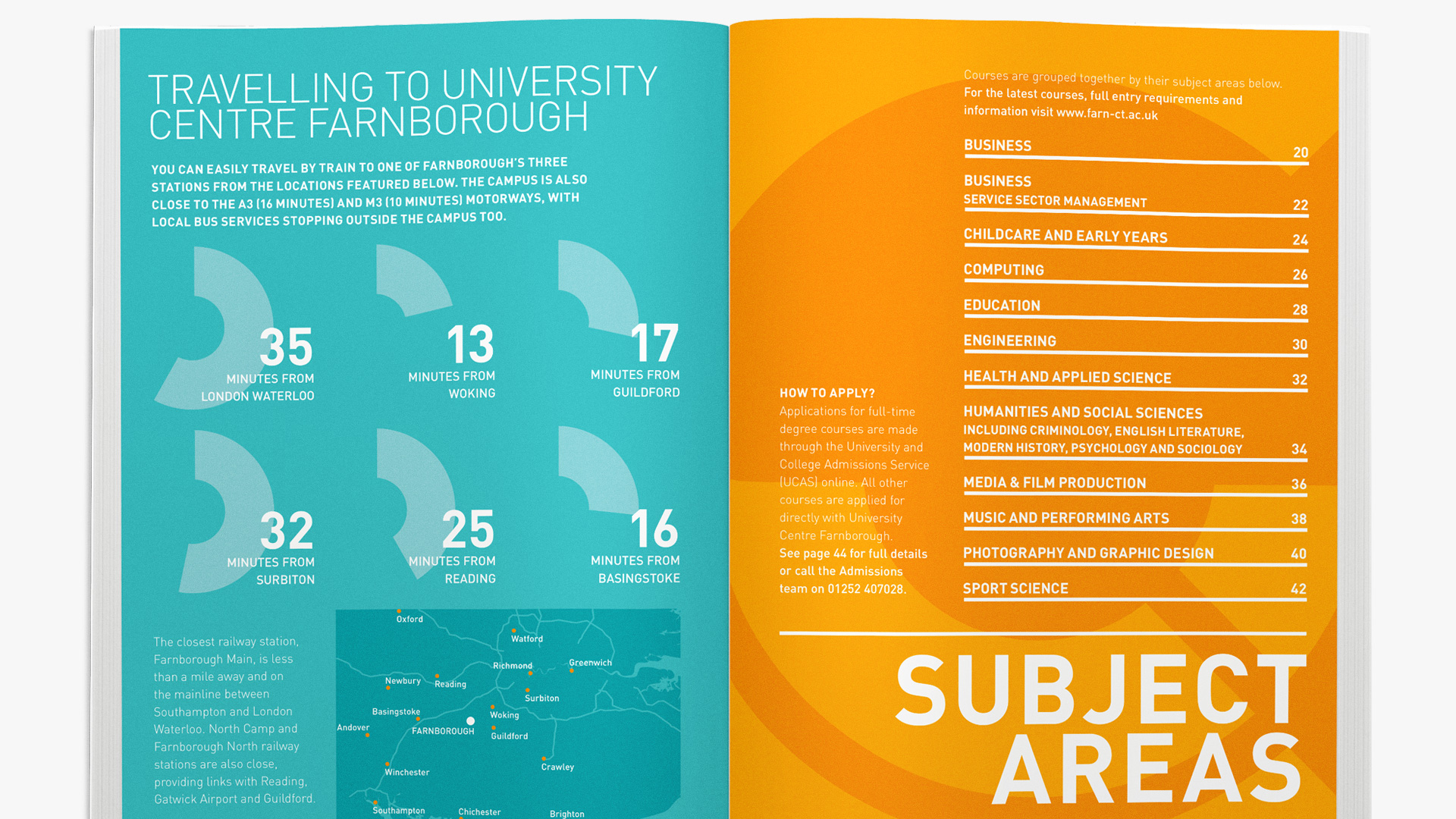
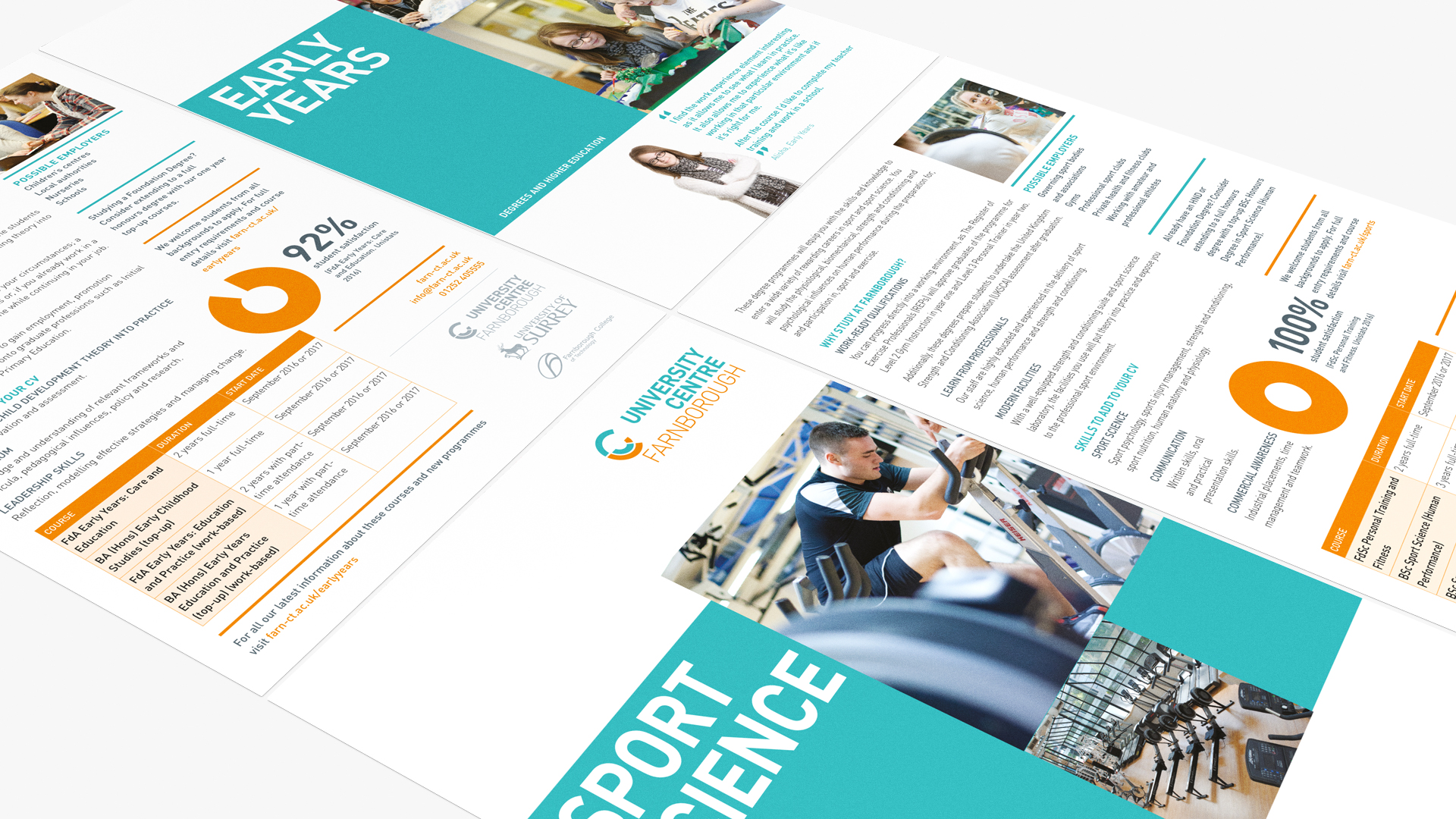
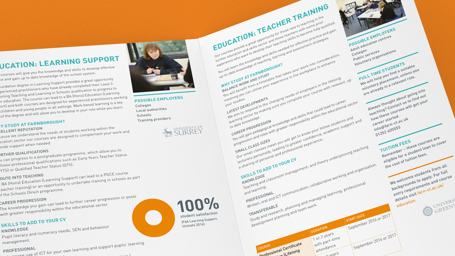
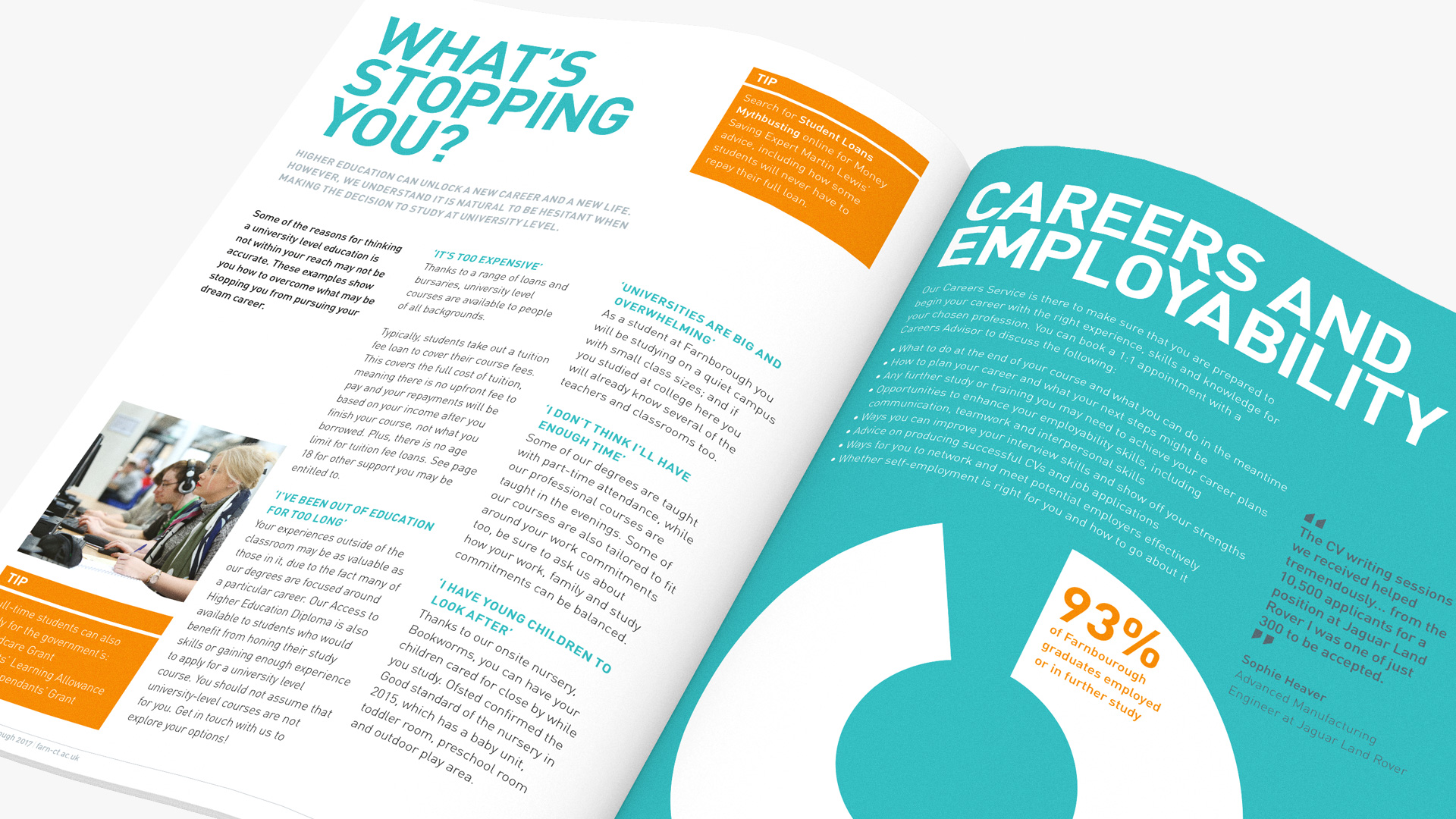
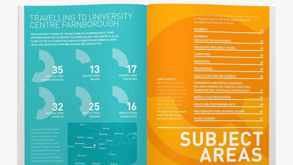
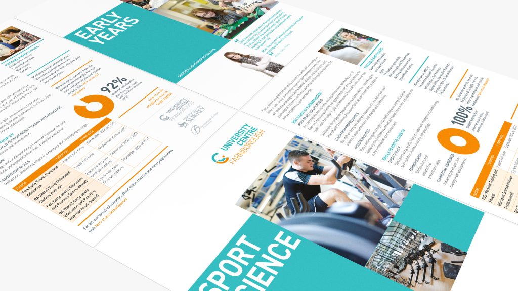
As a whole, this project was an exercise in the hierarchy of both typography and depth of information. We expanded some data to illustrate as infographics (reflecting the identity) which also allow for breaks in the text. As this is a relatively new identity we remained close to the guidelines, particularly the colour palette, which allows the identity room to establish itself.